How to Take Better Before and Progress Photos of Your Projects

There is nothing better than seeing the transformation of a project from beginning to end. Helping your clients visualize how you can change a space is an effective marketing strategy. To accomplish this you need quality, not necessarily professional, “before,” or progress photos of your projects. 

I find it very satisfying to see “before and after” photos that have matching compositions, and you can accomplish that without hiring your photographer to take the before photos.

It can be really difficult to figure out how your photographer might compose the final photos of a project, but if you use four techniques you can accomplish it with relative ease.

These four strategies will help you show off the amazing transformation you envisioned from the outset. 

How to take better “before” and progress photos yourself:

  1. Rule of Thirds Highlighting Key Features

  2. One Point Perspective

  3. Shoot From the Corners

  4. Consider the Time of Day

Rule of Thirds: Highlighting Key Features

If you’ve ever taken a basic photography or art course you’ve likely heard of the “rule of thirds.” There are no hard and fast composition rules, but “rule of thirds” is an old reliable one that’s used by architectural and design photographers. The idea is that the frame is split into thirds along the horizontal and vertical planes. When I’m composing a shot using the rule of thirds my goal is to put a key feature at the intersection of three lines in the grid. I have this grid superimposed over my camera’s screen and the iPad that I’m wirelessly tethered to. 

In the example below this extremely attractive wall, and fireplace are composed on the left intersection of the grid. 

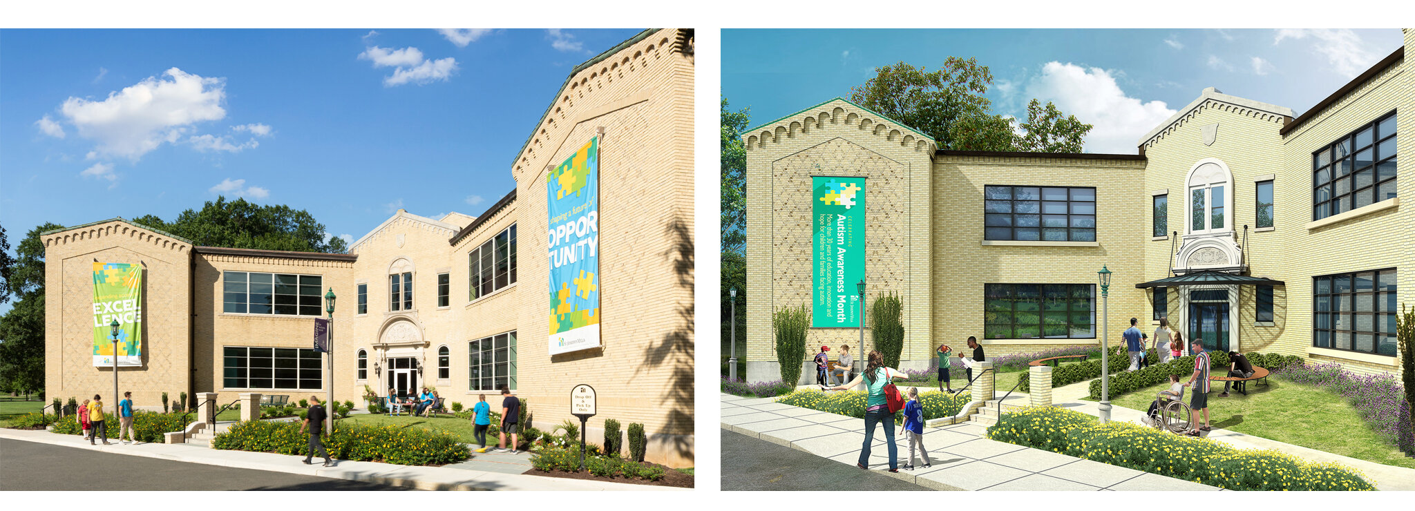
Below is a progress photo of the new VCU School of Engineering, shot for Kjellstrom & Lee. I’ve used the rule of thirds to highlight what has become an amazing feature wall with large interior windows that overlook the entrance to the building.

1-VCU.Eng.Progress-K&L-1.15.2020-2715.jpg

You can utilize this strategy when composing your own phone photos of a client’s current space, or a totally empty space. If you have an iPhone it only requires a couple clicks to get grid lines on your screen (Settings > Camera > Grid Button). 

One-Point Perspective

One-point perspective is most simply a composition that is centered on…well…one-point - a vanishing point. All the leading lines of the image should converge on the focal point in the center of the image. If you’re taking a before photo using a one-point perspective in an empty space, imagine where the entry to the space is, such as the front desk in a lobby, or the bar in a restaurant. Again, this would be a great time to use the grid lines on your iPhone. Do your best to make all the lines symmetrical. Try to level your image using ceiling lines, beams, and floor tiles. 

In this example I used the faucet and range hood to center the image, shot for Kenneth Byrd Design.

Walton.Rd_Kenneth.Byrd_3.17.2021-8-Dot.jpg

In this progress shot of the VCU School of Engineering I’m centered on the entry way transitioning between the existing building and the brand new building. I will likely take this exact composition when I go back to take final photos of the space.

Shoot From the Corners

This one is important when photographing residential or commercial spaces, but probably most critical in residential interiors. Your phone is not able to shoot as wide as a photographer's camera. Although, if you have the iPhone X or later you can shoot wide at 26mm. My widest lens is a 17mm, but my favorite lens is 24mm. So, 26mm is really, really close to that.

In houses, shooting from the corners is usually the best spot to capture as much of a space as possible. Even if you aren’t trying to shoot super wide, shooting from the corners of rectangular or square designed spaces will help you more effectively use the first technique - composing shots using the rule of thirds. 

Kukoski_Kathy.Corbet.Interiors_3.18.2021-5.jpg

Consider the Time of Day

Time of day is EXTREMELY important to photographers when planning a shoot. We generally don’t want bright, harsh light streaming directly into windows for our final photos. It’s also really hard for your phone to handle mixed light. The best way to avoid this is to take photos on cloudy days. Then you don’t have to worry about bright, mixed light in a space. If you’re taking pictures on a sunny day you need to take into account the direction a space faces. If you’re not sure then shoot between 10am-2pm. If you’re visiting a job site on your lunch break that might be the best time to snap some well-composed progress shots.

If you have any questions about how to take better before or progress photos please reach out.

If you’ve already taken before photos of your project and you’re ready to take final photos for awards submissions, marketing, and publishing lets schedule a time to talk about the project!

Case Study: St. Joseph's Villa Sarah Dooley Center for Autism

Many of my clients are doing incredible work, not just in terms of design, but also making a huge impact in our communities. Earlier this year I had the chance to work with St. Joseph’s Villa, in Richmond. SJV is a huge campus dedicated to working with children who have “developmental disabilities, diverse learning styles, mental health issues, homelessness and other challenges.”

SJV recently completed their new Sarah Dooley Center for Autism and, along with Odell Architects and Daniel & Co., hired me to photograph the finished product. 

SJV will be using the photos to help support their fundraising efforts. It is very important for them to have high-quality photos that clearly show how well the staff at SJV, and the building itself, support their students.

SJV’s staff and I worked hard to duplicate some of the key renderings.


Saint.Josephs.Villa.QPH.Architecture.Photographer.Architectural.Virginia.DC-Lobby.jpg

This shot was particularly challenging, because it had to be taken from the front doorway - with very little room to spare. It’s a panoramic shot including about 15 different images stitched together. 


One of the biggest challenges for this shoot was coordinating with the staff on “models.” The new building is not open to students yet, so there wasn’t anyone in the building. The SJV staff worked hard to stick to a schedule - based on our scout day and shot list - to have a variety of students come from different buildings at different times to model in most of the photos. 

Most of the students and staff had not seen the space - so, as you can imagine, there was a lot of excitement. 

We had to be patient with the kids, but they had to be even more patient with us! As you can see, they did an awesome job. Thanks so much to the staff at St. Joseph’s Villa!

2020 Year In Review - Favorite Interior Photos

Despite a slowdown in work last spring, I was fortunate enough to get to photograph some amazing projects in 2020. Here are some of my favorite interior photos, and projects from last year. 

Client: HDR, Inc, Project: Sheltering Arms Institute

HDR contacted me last spring to photograph the new Sheltering Arms Institute in Short Pump. It was an incredible project and building to shoot. These photos are of the main gym, where SAI’s physical therapy staff work diligently with their patients. The staff and patients were so helpful and patient with us on the day of the shoot. I love these shots because I think they really show off how bright and vibrant the space is, and also the people in it. 

Client: Apple REIT/Crestline Hotels, Project: Charlottesville Courtyard by Marriott 

I photographed the Courtyard by Marriott in Charlottesville for Apple REIT and Crestline Hotels last year over the course of two days. This shot is of the main lobby. It has an abundance of great seating, well-lit, and looks out on to Main St. in Charlottesville. The gray chairs in the foreground were super comfortable. I wish I was writing this post in one right now. 

Client: Kathy Corbet Interiors/Gardner Construction, Project: Residential Kitchen

You may recognize this award-winning kitchen if you get R-Home Magazine. Kathy Corbet and Gardner Construction won NARI Awards for this project. The light fixture, by Simon Pearce, range hood, reclaimed wood, built-in herb trough, and leathered countertops are awesome features.

Client: ENV, Project: SimpliSafe

The great team at ENV designed the new SimpliSafe offices in Willow Lawn, and they knocked it out of the park. This is the break area/cafeteria. It’s wide open and super bright. I like how clean this photo is despite the harsh morning light coming in from the left. I was able to use a linear polarizer and flash on site, and some post-production magic to create a photo that incorporates the light coming in without blowing the whole photo out.


The Summit for NICHIHA: The importance and effectiveness of retouching in architectural product photography

I’ve been using Photoshop for 20 years - much longer than I’ve been taking photos professionally. Architectural and interiors photography relies heavily on layering different exposures, and retouching out distracting objects in Photoshop. For me, that has always been one of the main attractions to this type of photography. 

Anyone that works in the construction industry and has tried to schedule a photo shoot knows that it can be difficult finding the ideal time. Often the ideal time doesn’t even exist. If you schedule the shoot as soon as a project is “substantially complete” you run the risk of punch list work being completed on shoot day, or furniture delivery delaying the process. If you wait until the client permanently moves in there are several other variables that can make it hard to get ideal conditions. No matter the timing and challenges, usually at least a little “Photoshopping” is needed to give the final photos the desired “finished” look. 

Fiber cement supplier, NICHIHA, recently hired me to shoot The Summit apartment building on Broad St. The twilight “hero shot” is my favorite photo from the shoot. 

The Summit - NICHIHA

The Summit includes two different exterior fiber cement wall panels in NICHIHA’s “Designer Series.” The Miraia (https://www.nichiha.com/product/miraia), and Illumination (https://www.nichiha.com/product/illumination). Besides getting good photos of the entire building, I needed to capture the details. This is where some serious retouching had to be done! Take a look at one of the unedited photos. What bothers you?

The Summit - NICHIHA

As soon as I arrived I could see workers knocking out punch list items, actual punch lists taped to windows, Pella window stickers, dusty windows, and shades pulled down to varying heights. None of these things are ideal, but all were eliminated during retouching. I use a variety of techniques including the Photoshop healing and cloning tools, as well as clipping, copying, and pasting “clean” windows. Sometimes zooming in on, and editing individual pixels! Below, I’m in the process of removing a shade.

Screenshots Pixel Edit copy.png

The goal in these photos is to highlight NICHIA’s product, and the building’s detail. None of the distracting elements are all that uncommon in real life, but in a photo meant to highlight important details and products they do distract from the audience’s attention. Take a look at the before and afters side-by-side.

Before.And.After.NICHIHA.QPH.Photo.Summit.jpg

NICHIA’s panels and The Summit are a beautiful addition to Broad St., and Scott’s Addition. It was fun shooting this project and dodging Pulse buses while doing it. 

Send me an e-mail (quentin@qphphoto.com) if you would like to have me photograph one of your next projects, or if you have any questions about my process. I look forward to working with you!


Quentin